The recent launch of Plymouth Gin’s new packaging has inspired Patience Gould to have a look at the design and packaging trends that prevail in the growing gin firmament.
We all know the important role that design and packaging plays in a brand’s marketing strategy – but it’s one that’s very easy to overlook – until that is when a new look is unveiled. Such is the case with Plymouth Gin. Gone is the art deco bottle, and huge sighs of relief for that, and in comes a uniquely fashioned bottle that befits a gin of Plymouth’s standing.
With the reworked livery, designed by London based Design Bridge, the Pernod Ricard-owned gin in the Chivas Brothers portfolio, has been given a new lease of life, and in an instant its super premium credentials have come to the fore. Often billed “the single malt” of gins, and one of only two gins in the world to have its own AOC in that it can only be produced in Plymouth, the new packaging with its rounded bottle shape and antique-type style pays tribute to its heritage – as does the oval shaped label which marks a return to earlier packaging – and together with the copper cap all these elements combine to underline the gin’s artisanal credentials.
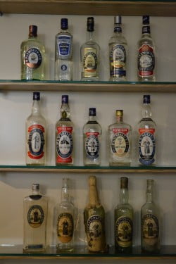
In short the new look is perfect for Plymouth. Of course it’s not the first design and packaging overhaul for the gin (see image), which, until it landed up in the Chivas portfolio following Pernod Ricard’s acquisition of the Swedish giant V&S of Absolut vodka fame, had never really had the attention it deserved. It was bandied about from pillar to post and each ‘bandy’ was accompanied by a packaging change.
Along the way we went from the stonking red, blue and white labelled bottle to the rather wishy-washy pastel labelled bottle, which sported a plastic cork-like stopper. This was not at all popular Stateside as it lacked on-shelf presence and then rather unexpectedly it went art deco. This was several steps too far, it didn’t suit the brand and, because it was then owned by V&S, the Swedish producers of Absolut vodka, was deemed to be far too ‘vodkerish’. It was a heavy weight bottle though and would have made a good weapon, should one be needed on the way home, but it wasn’t right for gin, let alone Plymouth given its heritage.
So what is it that’s so right about the latest reincarnation and how should a gin be packaged? Of course it depends on the brand’s origins and history, if indeed it has a history. Plymouth does. For starters it has been distilled on the same site since 1793 at The Black Friar’s Distillery in Plymouth – the oldest working distillery in England.
Built in 1431, the distillery was reputed to be originally a monastery for the Black Friar Monks and most prominently remembered as the location where the Pilgrim Fathers stayed the night before they set sail on the historic Mayflower Ship for their voyage to the New World in 1620. An image of the Mayflower on the label and a Black Friar icon embossed into the flint glass underlines the gin’s intrinsic link with the city. The previous art deco bottle paid no homage to this rich history, a missed opportunity one thinks.
Interestingly, until the advent of Bombay Sapphire with its state of the art-designed blue bottle in the late 1990s, the standard colour for gin was green. Whether it was the label or the bottle itself, green was the definitive colour. This was epitomised by the likes of Gordon’s and Tanqueray, and derived from the original dark green of genever bottles as well as referencing the green foliage of the juniper bush.
The then Allied Domecq took this one step further and in the 1990s relaunched its travel retail contender Crown Jewel in purple livery, no doubt attempting to imitate the colour of the actual juniper berry – but this proved to be very wide of the mark. The colour purple may denote royalty but it definitely does not denote gin.
Bombay Sapphire broke the mould and moved gin out of the commonplace green colour spectrum, while at the same time proving that there was a need for a super premium gin. Producers have taken note and have been noticeably more avant-garde when it comes to packaging, as well as marketing. Consider Hendrick’s, in its squat medicinal dark brown bottle – 15 years ago this would have been unthinkable for a gin brand but it’s been a remarkable success for William Grant’s.
Of late of course there has been a plethora of artisanal gin launches; Bulldog, Sipsmith and the Scottish gin Caorunn, to name but three – and it’s becoming apparent that it’s not only the colour of a gin’s presentation which is important these days, but also the bottle shape. These three examples are both rounded and tactile. Sipsmith is in a clear tallish version of the Absolut bottle, but with a cork stopper, while Bulldog is a rounded blue-black version of the old-Dutch style gin Genever. As to the ‘handcrafted’ Scottish gin Caorunn this comes in a more decanter style bottle, with all the hallmarks of its Celtic heritage apparent. Crucially all these bottles communicate the message that there is gin inside. Not all new arrivals do the same.
Talking of genever it’s interesting to note BB&R Spirits launch of its super premium gin, No.3. The company here has gone right back to gin’s traditional routes, drawing inspiration from old genever bottles and opting for a rich dark green – so we’ve come full circle! And by the way it consistently wins serious design awards so it’s obviously working.
It might seem from these few examples that today anything goes when it comes to gin and its design and packaging, but that would be a mistake. For unlike vodka, which relies solely on its presentation, gin has two other important USPs to underline and that is the use of botanicals in its production, and its rich history. One brand that has always stood out from the green pack is of course Beefeater – but then this gin has always paid homage to its namesake, the guardians of the Tower of London, and to the capital city where it is still produced. Red has always been Beefeater’s colour and its label has always sported a Beefeater in full regalia. Indeed with its clear London brick-shaped bottle, Beefeater is an icon of all things London and Chivas Bros. would not have it any other way.
So too, thanks to its recent redesign is Plymouth Gin, a brand which has been repackaged befitting a spirit which to this day is still produced within the walls of this historic city. Two brands then that now, at last, both base how they look on their very different historic provenances. Thank goodness this gin duo is now in the safe hands of brand owners who clearly understand that gin should look like gin.