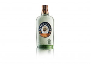
 Great to see that Chivas Brothers, the Scotch whisky and premium gin business of Pernod Ricard, has introduced an immensely stylish new look for Plymouth Gin. It’s all part of a strategy to move Plymouth Gin upmarket alongside a global price increase.
We’ve long thought that Plymouth’s quality and heritage have never been properly recognised and that’s partly because it has been sold too cheap. During its dog days of being shuffled around large drinks companies Plymouth was often the victim of heavy discounting in both the on and off trade by brand owners who really wanted to promote their own flagship brands. In fact by any measure Plymouth Gin is the single malt whisky of the gin world and that should be reflected in its price and its image.
Designed by graphic maestros Design Bridge, the bottle itself is stunning with a new rounded shape and antique style that pay tribute to the unique heritage of Plymouth Gin, while the oval label sees a return to an earlier example of the packaging, enriched with copper to reflect Plymouth’s artisanal credentials. A copper cap mirrors the single copper pot still that has been used in production since Victorian times. The new packaging launched into Spain in late 2011 and is now being rolled out into key markets globally. Taking Plymouth Gin into the super premium category is a bold move on the part of Chivas Brothers. It’s not an easy thing to do with an established brand but it’s unquestionably the right move both for now and in the long term. Plymouth Gin we salute you!


